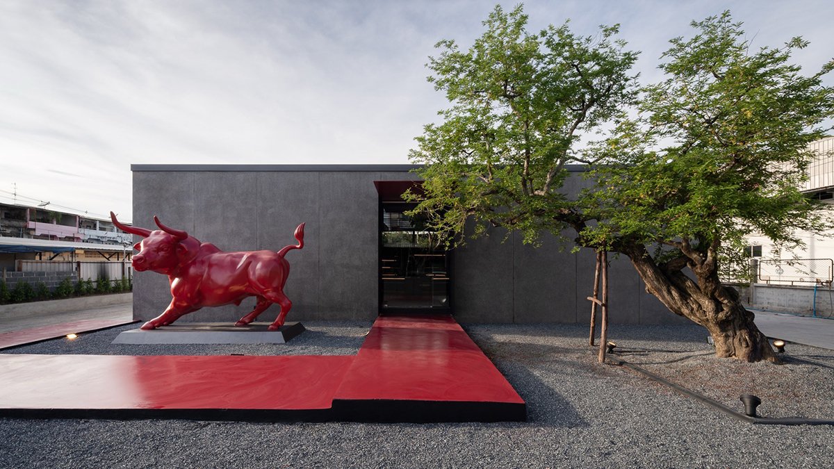
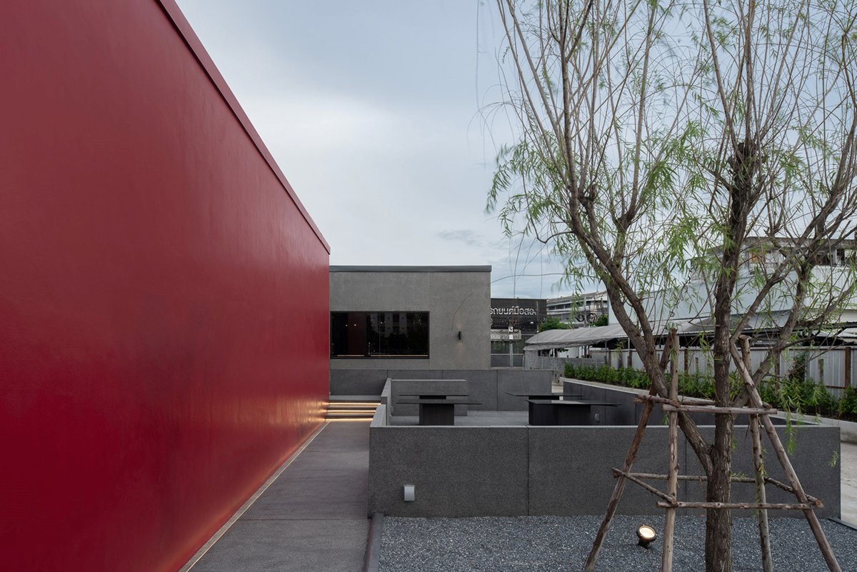
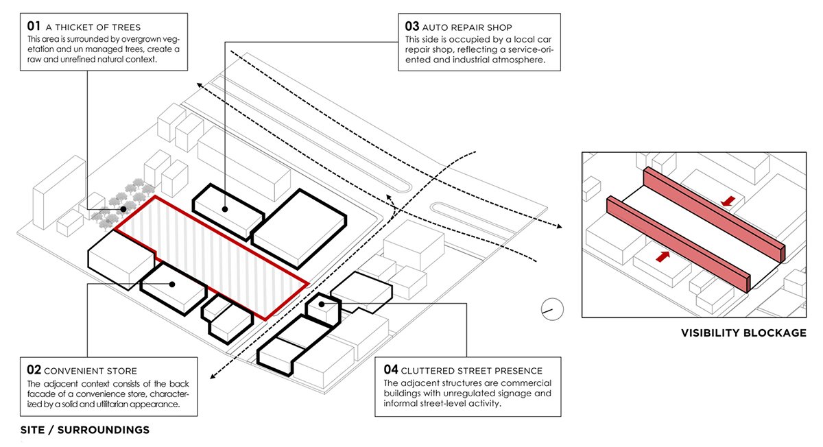
Excerpt: Akamori Restaurant by Touch Architect, located in a visually cluttered urban setting, is conceived as a calm, enclosed mass that turns inward to create its own atmosphere. A dark grey box clad in textured concrete, it screens out the unappealing context while focusing attention inward. A vivid red plane cuts through the form, symbolizing the red sun and a skewer, embodying warmth, appetite, and the brand’s quiet intensity.
Project Description
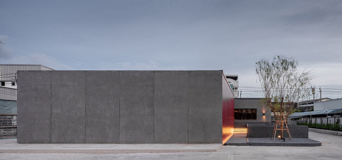
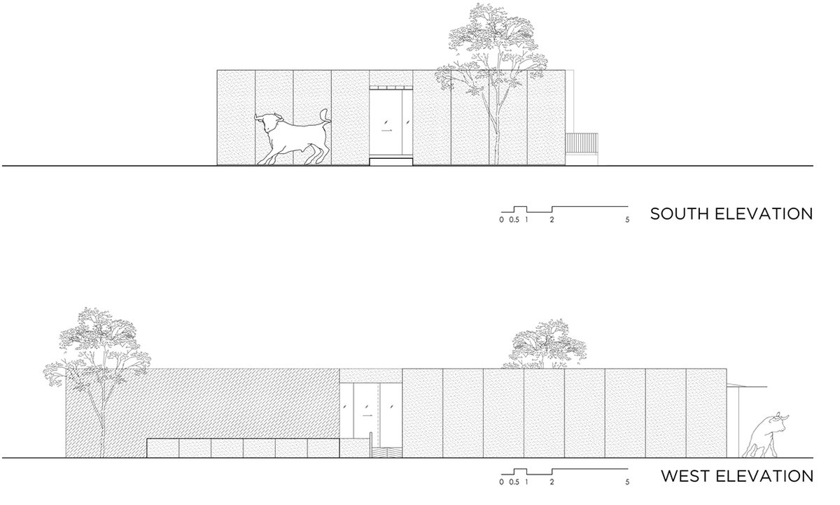
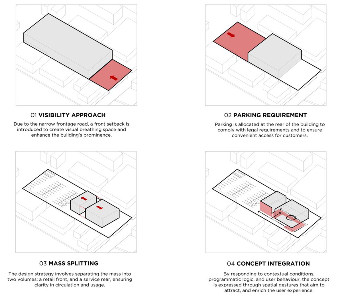
[Text as submitted by architect] Located in a visually cluttered urban setting, Akamori is conceived as a calm, enclosed mass that turns inward to create its own atmosphere. The building’s form is deliberately simple, a dark grey box clad in textured exposed aggregate, and is designed to screen out the unappealing context while focusing all attention inward.
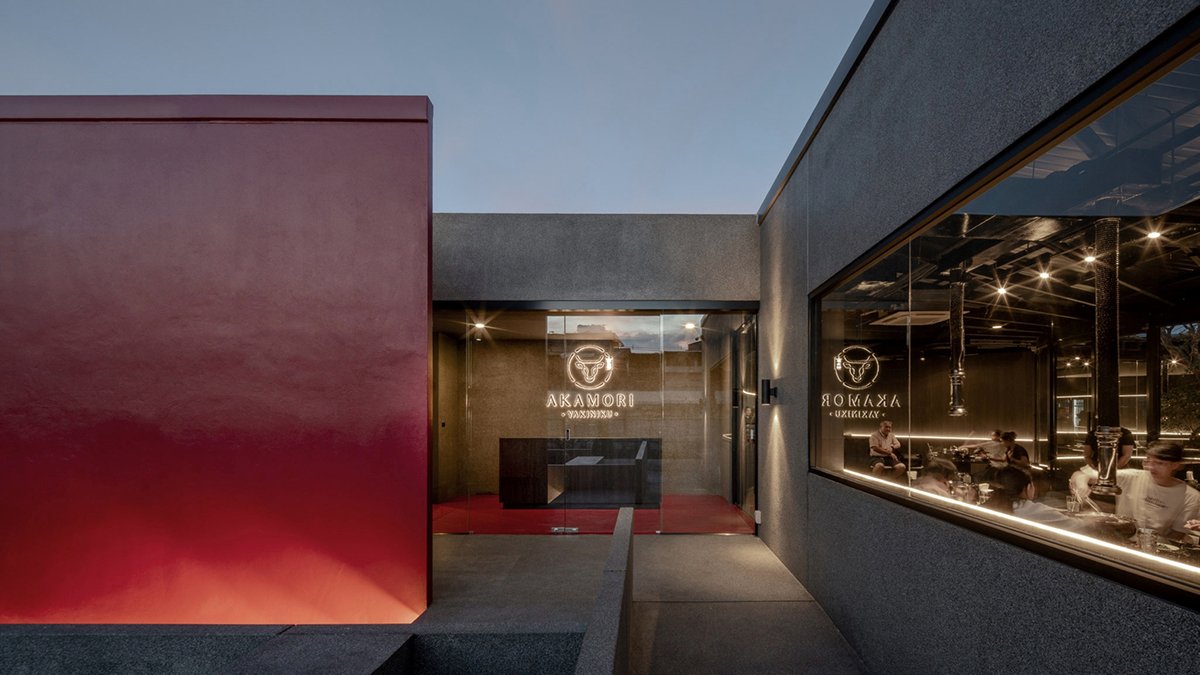
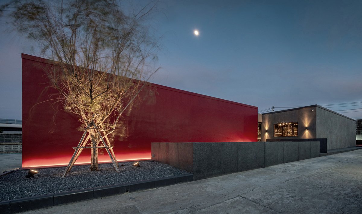
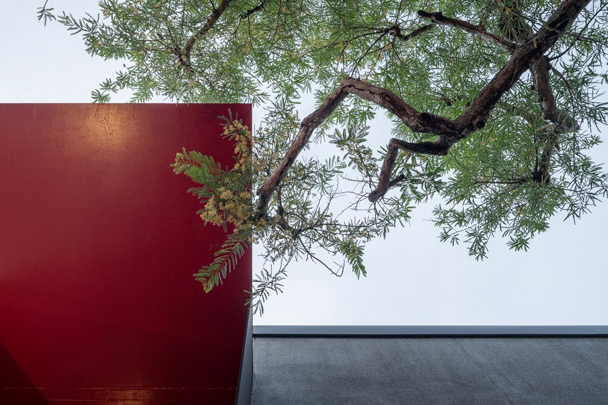
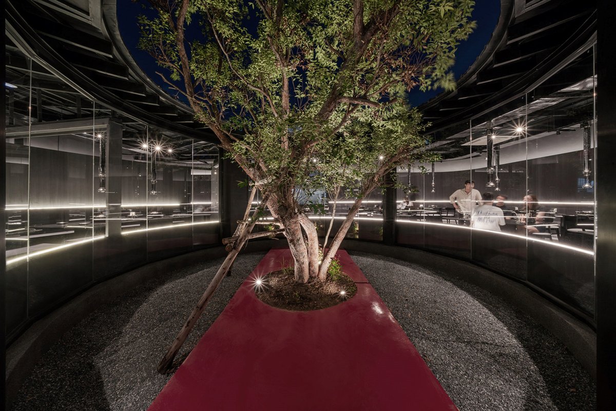
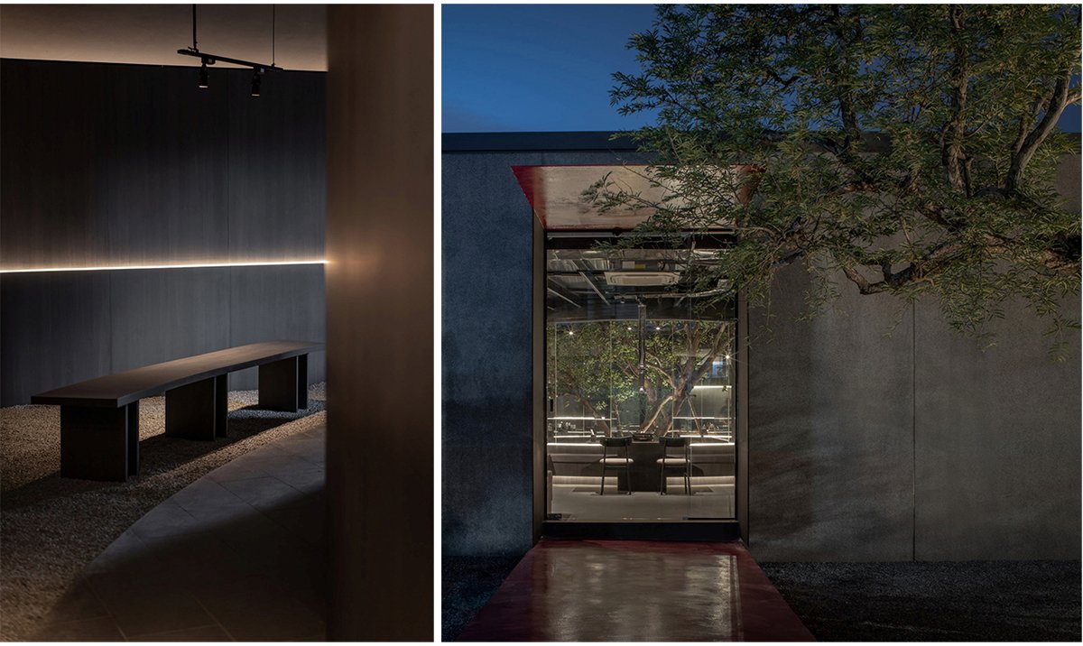
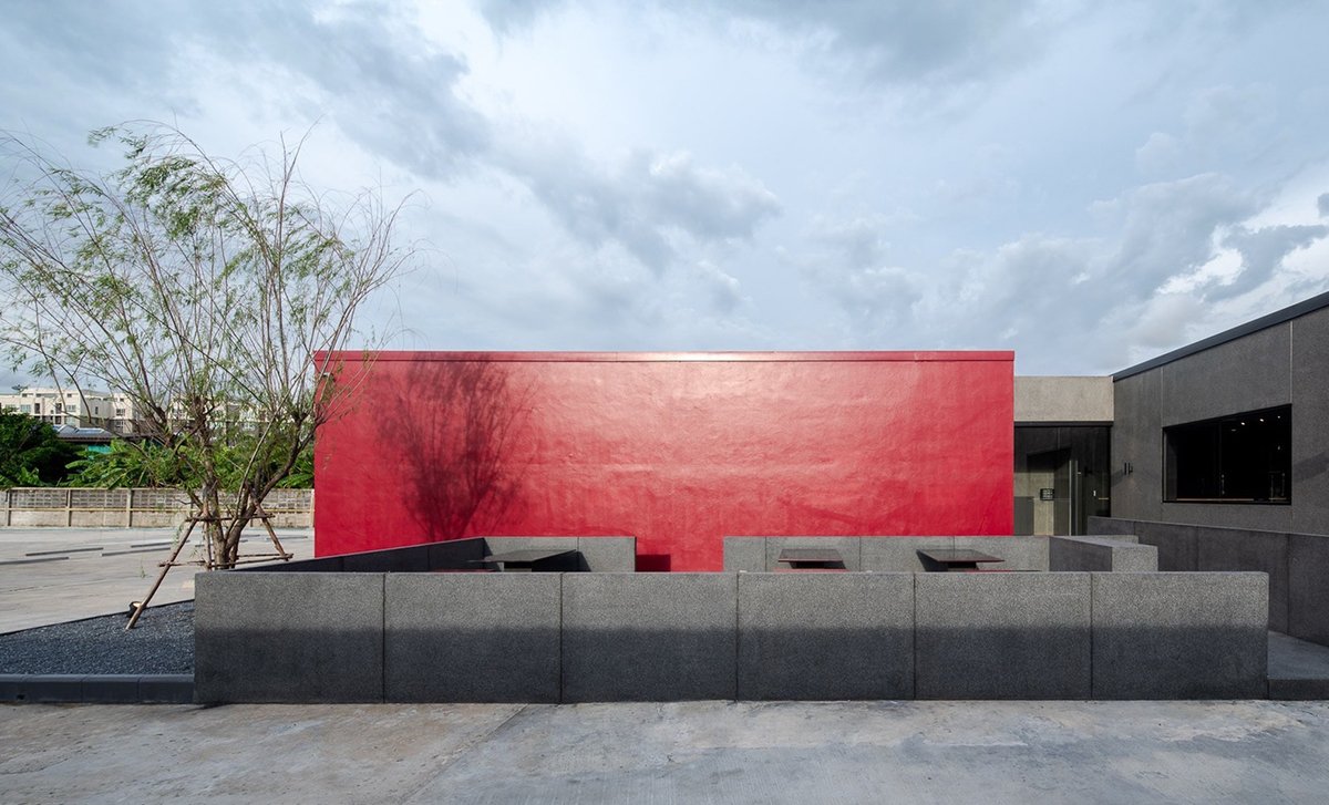
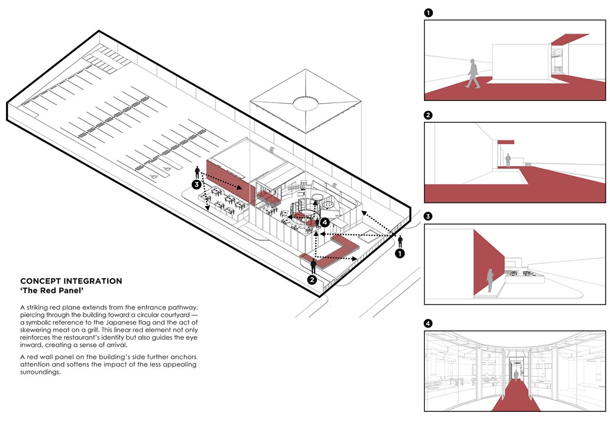
A single bold gesture defines the architectural narrative: a vivid red plane cuts through the front of the building, extending from the entrance toward a circular central courtyard. This red element serves both as a spatial guide and a symbolic metaphor evoking the red sun on the Japanese flag and a skewer piercing through a grill. The color red, associated with appetite and warmth, contrasts sharply with the muted exterior, drawing the eye inward and anchoring the brand identity of this Japanese yakiniku restaurant.
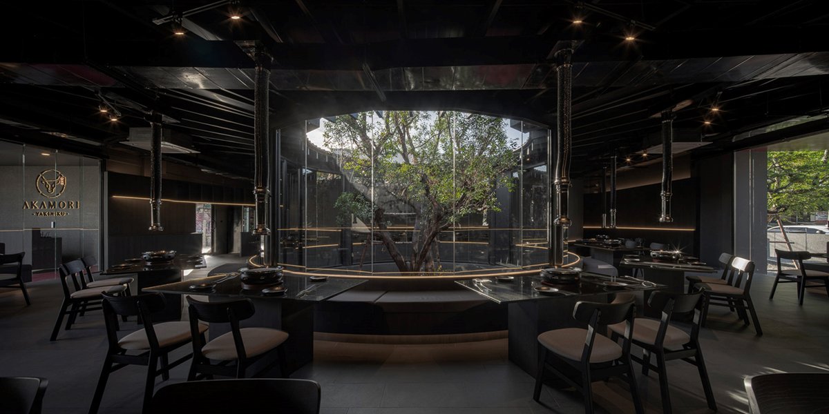
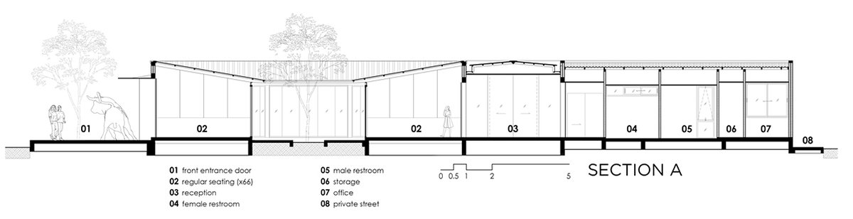
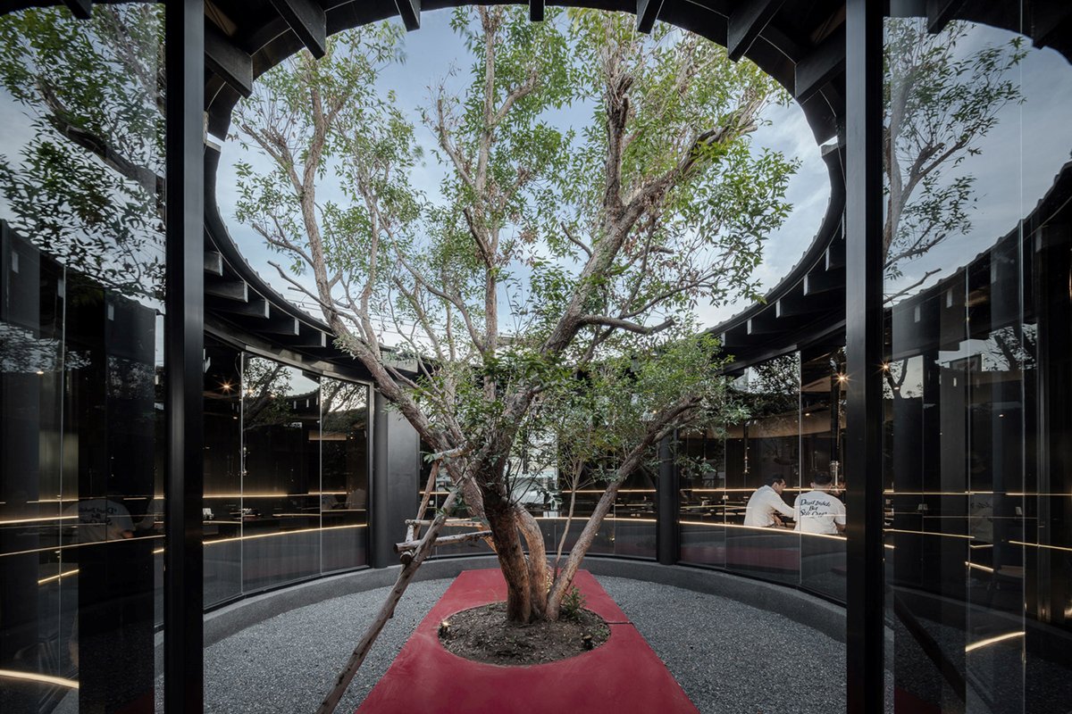
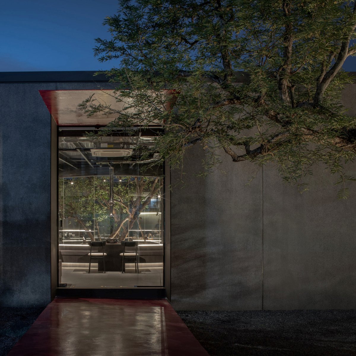
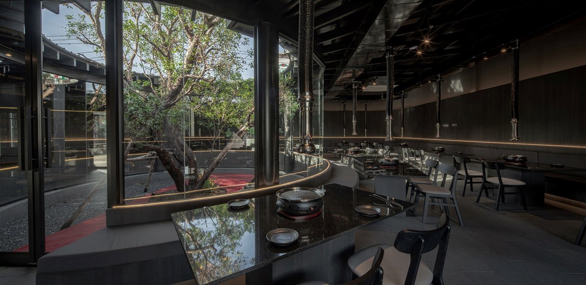
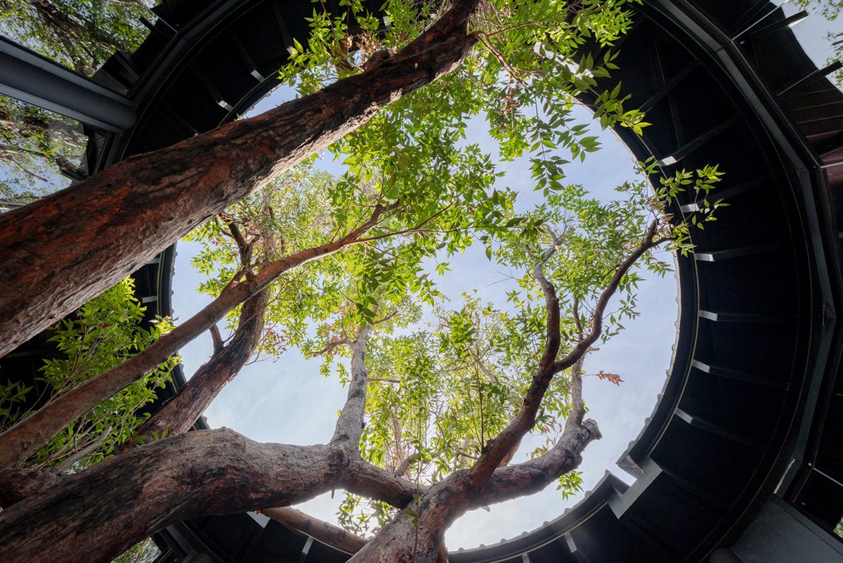
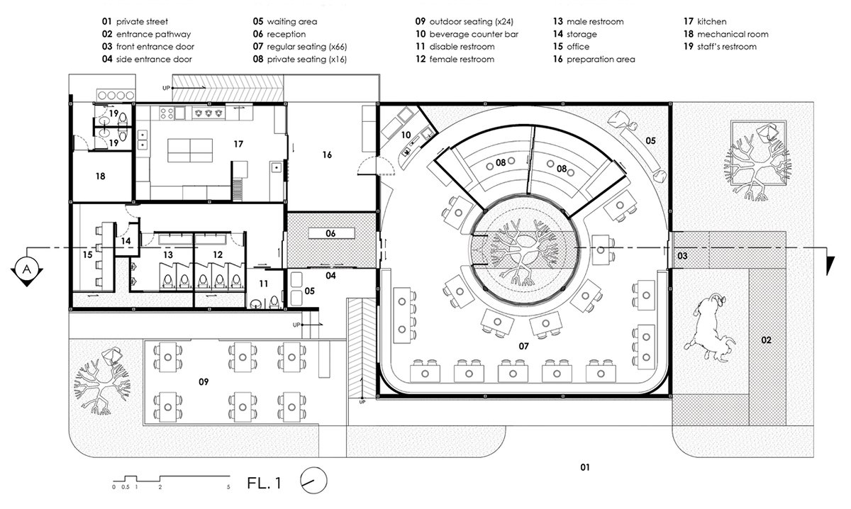
The program is divided into two primary volumes, which are: the main dining building, which wraps around a large internal courtyard centered on a mature tree. This courtyard is fully glazed, creating a calm, focused space visible from every table, including two elevated private rooms designed in a traditional Japanese style, with sliding partitions for flexible use. The service building at the rear, which supports kitchen and utility functions, is connected discreetly via a transition space that also serves as the main entrance lobby.
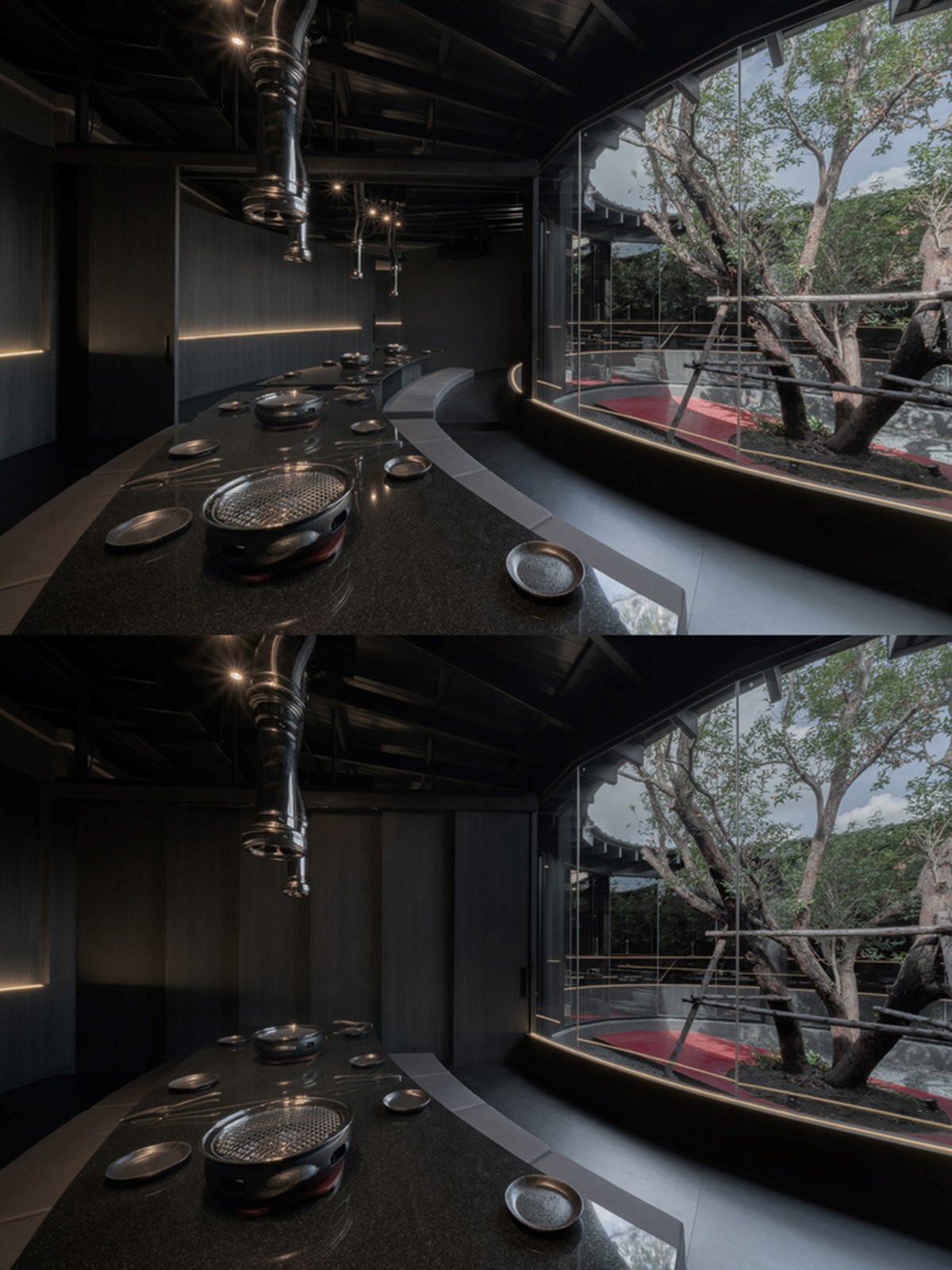
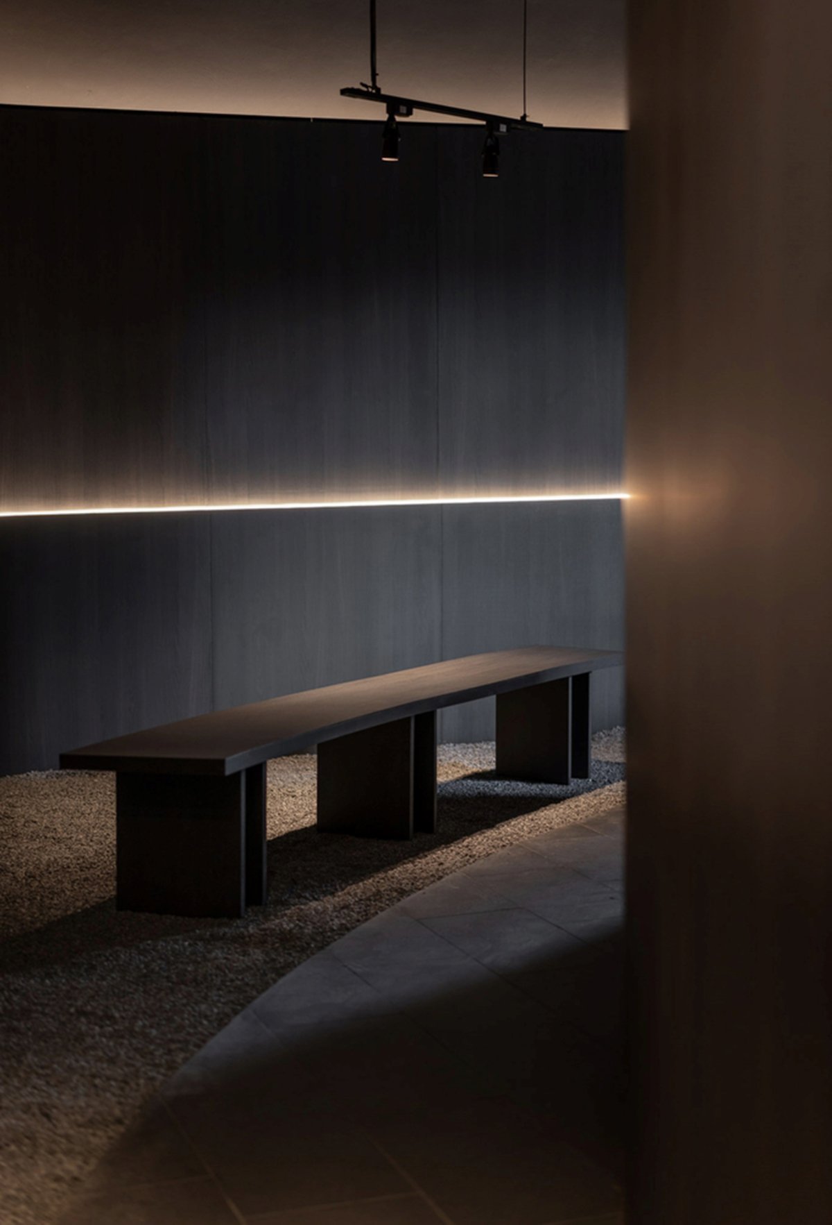
A narrow, softly lit corridor lined with gravel and shadow curves alongside the dining zone, enhancing the sense of spatial contrast, from dark and enclosed to light and open. Outdoor seating is tucked beside the building and visually anchored by a big red wall panel, strategically positioned to block and redirect views away from surrounding visual noise.
Materially, the use of dark grey sand-wash concrete provides a textural richness to the otherwise minimal mass, offering durability while enhancing shadow play. In front of the building, a bright red bull sculpture and a lush green tree stand out against the muted architecture, reinforcing the visual identity of the brand.
Ultimately, Akamori expresses a quiet intensity. Through geometric clarity, material restraint, and symbolic gestures, the design creates a spatial experience that is both emotionally resonant and functionally precise, transforming a simple box into an architectural expression of flavor, focus, and fire.
Drawings
Images