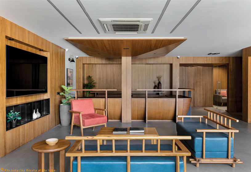
Excerpt: GIC Prime by CraftsPOD Design Studio is conceived as an Imaging Centre that pushes the barrier of radiology design beyond constraints, creating curated interconnected spaces. The interior design explores transparency while maintaining privacy, using frames, offsets, and spatial layering to regulate visual connections, resulting in a calm, open yet controlled environment for patients and practitioners.
Project Description
[Text as submitted by architect] Spread across an area of 10000 sq ft, located at one of the prominent locations in Ahmedabad is an Imaging Centre that pushes the barrier of Radiology and Diagnostic care. We aimed to design beyond the tightly knitted constraints of such healthcare-related programs, resulting in a spatial layout that caters to curated interconnected spaces, achieving the need for transparency while maintaining privacy as diverse situations suggest.
Programmatically, the office is spread between four floors – each floor has its reception, waiting area, counselling and doctors’ rooms. Primary functional spaces for MRI, CT-Scan, PET- CT, Sonography, X-ray, Mammography, DEXA etc. are distributed among the first three floors. The top floor houses the doctor’s area which includes a lecture zone, cafeteria, accounts and staff rooms.


The design centres around the idea of creating a space which caters to patients, exhibiting a sense of calmness and repose as a part of their experience. On all floors, the waiting areas along with the reception, being the most public part of the program, are situated towards the front thus having better exposure to natural light as well as a better connection to the outside.
Surrounding the waiting areas are the doctor’s cabin, counselling rooms, and private waiting rooms where one tries to play with the connectivity between spaces. Through manifestation, there is an attempt to regulate visual connections in such a way that it doesn’t hinder the need for privacy in such spaces.
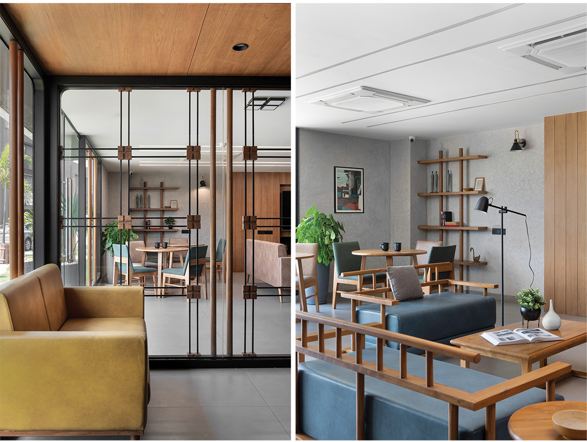


In an orderly manner, the increase of transparency is complemented by creating frames, enhanced through contrasting and alternative elements. Through the use of thinner sections of metal rods as a part of the composition of the frames, such difference in language is created to make the connections more prompt.
These intents further relate to the circulation pattern and organization of spaces, beyond the limitation of elements or material choices. The design creates mass in the form of cabins which enclose the void of the waiting/reception area while maintaining a degree of transparency between spaces.


Offsets are created to form an in-between space between the public and private spaces which also work as transitional spaces. These become mediators between space, allowing to alter scales as per necessity. In certain cases, these offsets also serve as a visual barrier between both spaces creating a mass complimented by limited openings.
In the waiting area, the reception acts as an anchor point which holds all things together through its position as well as the gesture. It is set apart from the remaining spaces through the pattern of the roof, lighting and the backdrop. The remaining functions which are required to be enclosed to prevent radiation exposure are situated at the end of the floor establishing a strong sense of hierarchy as one moves from the front to the back. There was a need to break scales as one moved from one space to another, as per the need of the functions.


This was done by altering the material, treatment and positioning of the ceiling, changing the nature of openings, adapting a differing lighting quality and modifying the organization of furniture.
Despite the strong dominance of the programme which requires the flow of activities and movement in a certain way, we have managed to create a space which feels open and vibrant. The lighting of the space further complements the design concept. Large profile lights illuminate the waiting area, while focused work lights are situated in areas which require procedures. In common areas, wall lights are also used to illuminate elements and highlight textured walls.

The materials palette for the project is chosen to accentuate the concerns further. A palette of natural teakwood and black metal is chosen to highlight the overall design. The textured grey walls and colourful furniture add vibrancy to the space. Wood is used to create mass and is hence used on vertical surfaces and certain furniture elements.
In spaces where thinner finishes are to be established, we have used metal in the form of frames, table tops, metal grills, etc. This also helps to create a contrast between the wood, the grey rustic finish of the walls and certain elements which are highlighted. Metal frames are used in certain spaces to complement and contradict the mass created by wood.

Wooden panelling serves as a backdrop for the furniture and metal frame each highlighting and complimenting the other. Thin black sections will induce transparency because of which they are demarcated that way. Alignment of openings and elements and orientation of furniture with the frames enhance the visual frames which are created.
Overall order is maintained in space by the spatial character of elements. Solid wooden rods in Furniture are consistent with that of shelves and storage, creating a coherent geometric order. Overall, the geometric order comes as an overall character of space where each element has coherence in space, where nothing gets highlighted as an individual element but acts as a part of the overall space.
Images


